Kyachi · Women's wellness · Netherlands
A supplement brand that had to look like a beauty brand
The work
Himalayan shilajit and maca root, in a gummy, for hormonal balance. We built the brand from a founder's idea: the logotype, the jar, every product image, the full product page and a store that loads twice as fast as the one it replaced.
Seven weeks from first conversation to a live store. Nothing was photographed.
Results
What the work moved
The logotype
Written, not set
A high-contrast display serif with one long swash running out of the K and under the whole word. On plum, over the brand's own floral line pattern, it needs almost no movement to hold a band: the pattern drifts, the word breathes, and one soft light passes across the letterforms.
Blush and cream are the shelf, plum is the type, cacao is the gummy. Nothing else enters the palette.
Packaging design
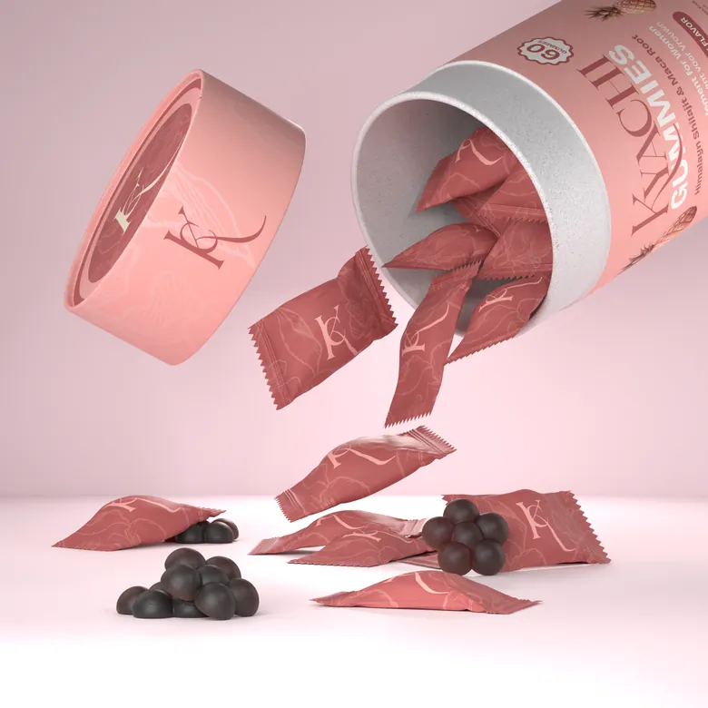
Sixty gummies, individually wrapped
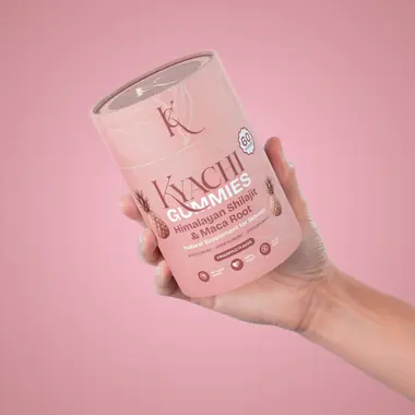
A kraft tube, a debossed lid, and sixty single sachets so a dose travels in a handbag. The label is half design and half regulation: the nutrition table, dosage, allergens and certification marks cannot move for aesthetics.
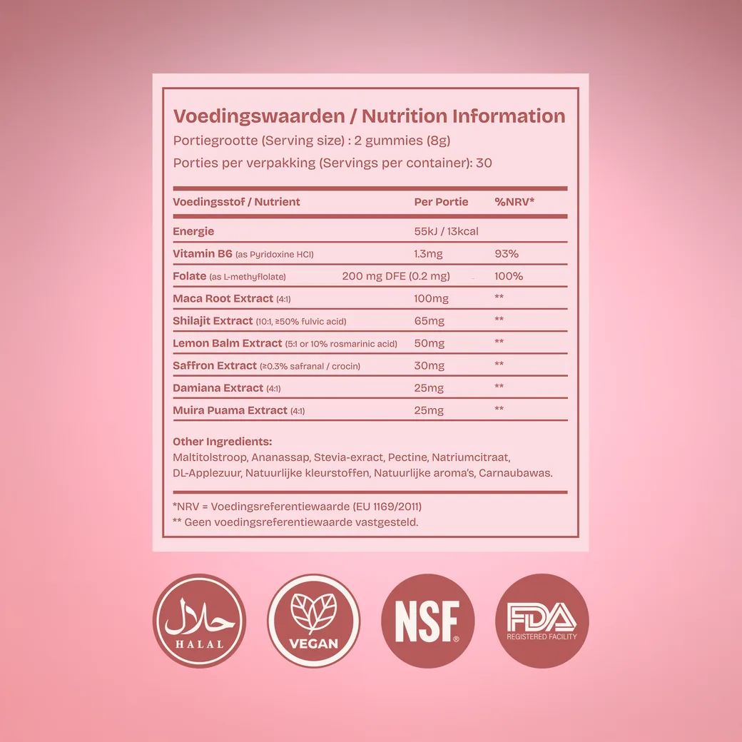
The back of pack
Marks that cannot move
Halal, vegan, NSF and FDA. A supplement panel is half design and half regulation: the nutrition table, the serving size, the allergen line and the certification row are all fixed by law, so the layout is built around them rather than the other way round.
- Serving size and servings per container, set first
- Per-serving column and daily value, in the required order
- Allergen and warning copy at the legal minimum size
- Certification marks at the foot, never resized
The two actives
Where the ingredients actually come from
Shilajit is scraped from Himalayan rock and maca is grown at altitude in the Andes. Both stories are visual, so each active gets its origin beside the panel that explains what it does.




Product page
The page is the pitch
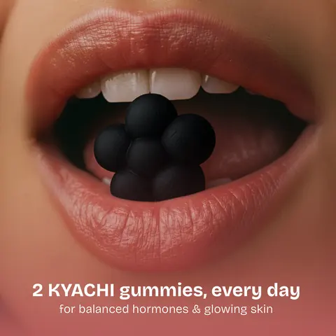
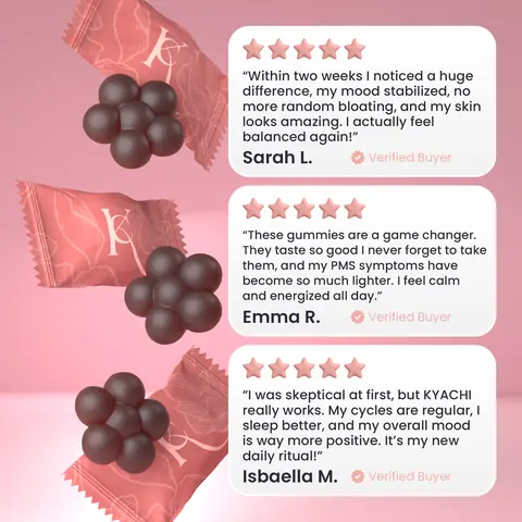
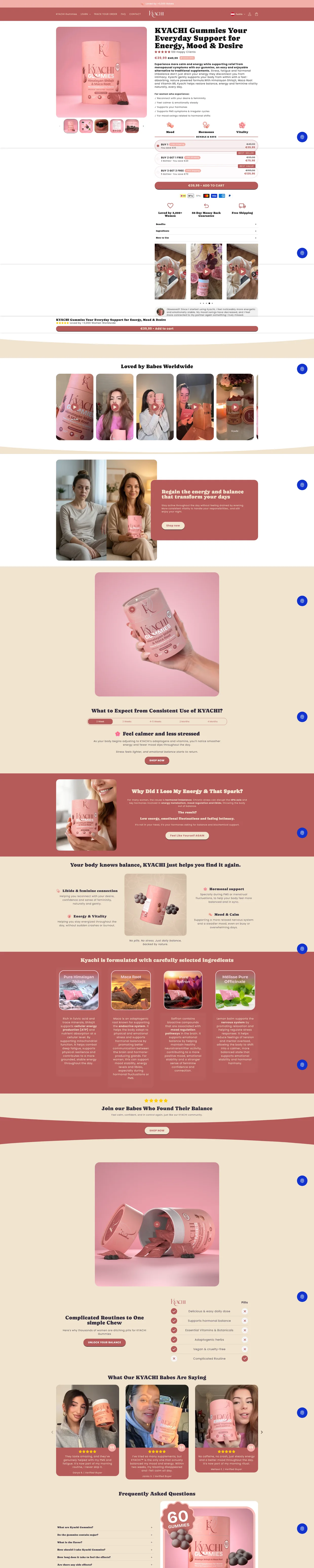
Almost all of the selling happens on one scroll, so every module was designed rather than themed: the dose, the two actives, the reviews, the objections. Each one is a rendered asset, not a text block on a stock photo.



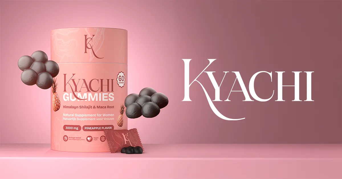
3D product
One model, every angle the store needs
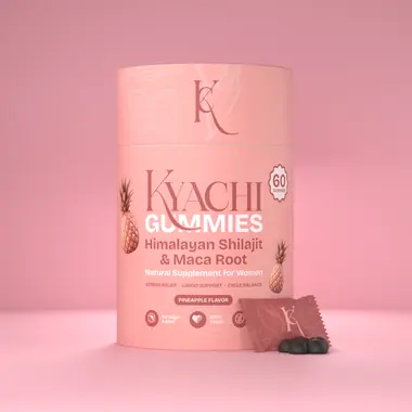
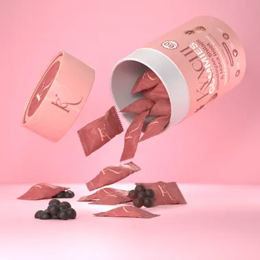
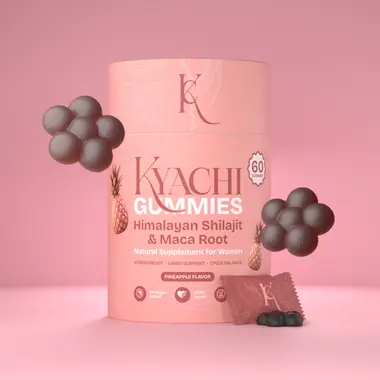
The tube, the lid, the sachet and the gummy are models. Front, top, tipped, floating, on blush or on cream, all of it comes out of the same file at the same lighting, which is why a new asset costs a render rather than a shoot.

Store build
Twice as fast as what it replaced
Same modules, assembled into one scroll and shipped on a build where the images are sized for the slot they sit in. Largest contentful paint came down by roughly half against the previous store.

“Mira Visions took a simple idea I had and helped turn it into a real, solid brand. They paid attention to every detail and that made a huge difference.”