Nuarai wordmark animation
Nuarai wordmark motion by Mira Visions, letter spacing opens outward with a light sweep across the letterforms.
Brand identity, packaging, content and an e-commerce store for a luxury niche-fragrance brand, the full kit.
Read the case study- Running time
- 0:03
- Format
- 1600×460
- Sound
- None, a silent film
- Mira Visions
- Made by Mira Visions
The brief
The Nuarai wordmark is a light geometric sans with wide tracking, always locked to its registered mark and never tinted or outlined. The animation had to give that very quiet logo a moment of presence, for a luxury audience in Dubai and London, without breaking any of the rules the identity is built on.
What Mira Visions did
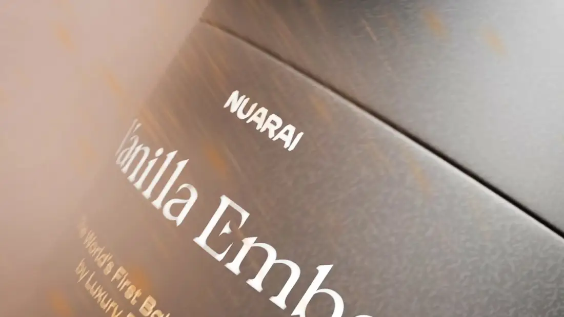
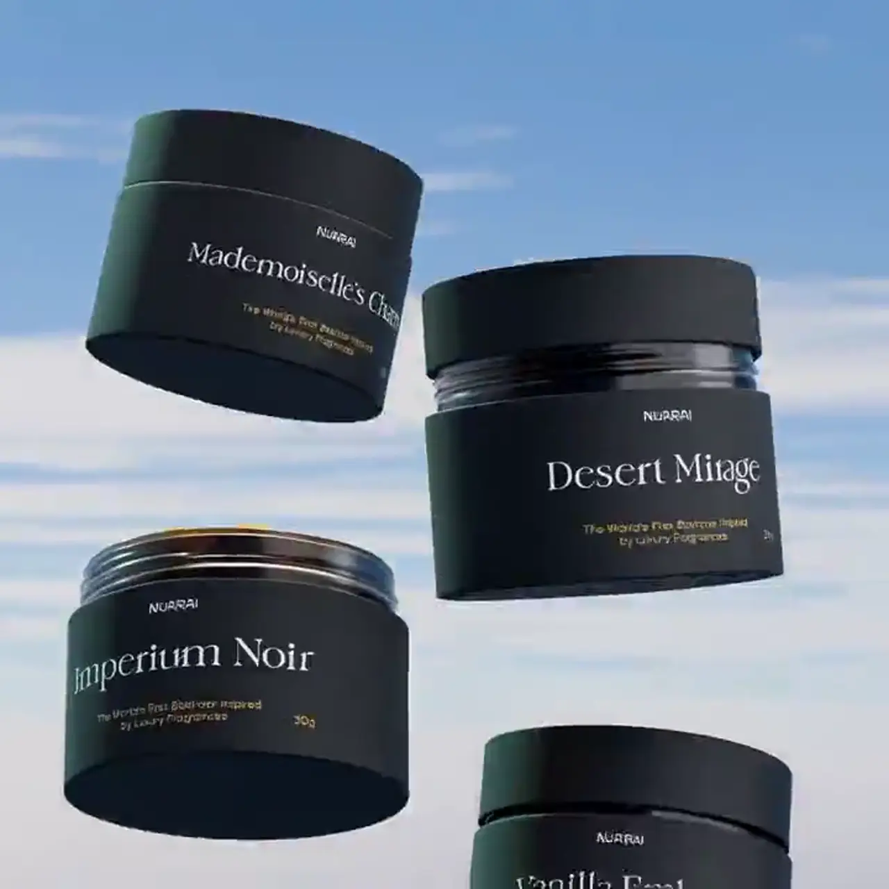
Mira Visions designed the Nuarai identity, then animated the real logo file rather than a redrawn copy, so the lockup on screen is exactly the one on the jars and boxes.
Tools
- Illustrator
Where it runs
A three-second wide band, silent, meant as a signature: the sting at the start or end of a campaign film, a header band on the store, or a title card in a presentation to retailers.
Delivered as a 1600×460 wide banner file, 0:03 long, silent.
Behind the scenes
Only one thing moves: the spacing. The letters open from five percent tracking to full, a single light sweep crosses the letterforms, and the registered mark settles in last. The lockup stays one white tone from start to finish, because the identity says the wordmark is never tinted, and the motion had to respect that as strictly as the print does. At three seconds it is the shortest film in the Nuarai library, and it is meant to be: a signature, not a scene.
More films from Nuarai
Let's build something worth talking about.
Tell us about your project. You'll hear back within 24 hours with honest next steps, no pressure, no jargon.
We reply to every inquiry within one business day.