Turapura logotype animation
Turapura logotype motion, the turtle mark surfacing through peach liquid before the wordmark settles.
Brand, packaging, content and store for an ethical, science-led skincare brand, the full kit.
Read the case study- Running time
- 0:05
- Format
- 1290×380
- Sound
- None, a silent film
- Mira Visions
- Made by Mira Visions
The brief
Turapura donates from every order, and the turtle is the emblem of that. Rather than sit beside the name as a second logo, the turtle is drawn into the final letter. The animation had to reveal that hidden mark, then let the lowercase wordmark settle, so people learn where the turtle lives.
What Mira Visions did
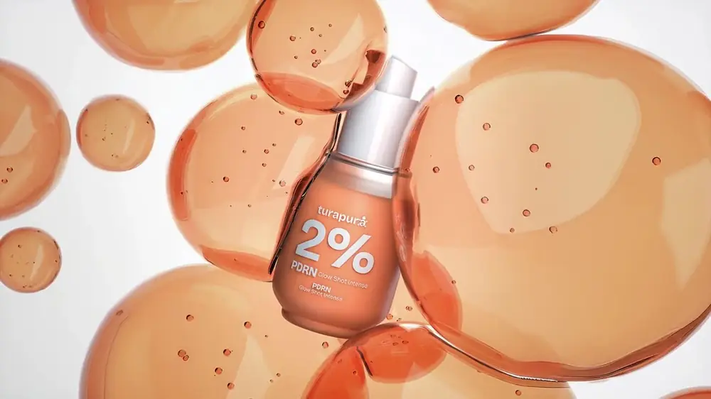
Mira Visions designed the Turapura identity, including the turtle drawn into the a, and animated the logotype over the brand's own bubble footage rather than a stand-in background.
Tools
- Illustrator
Where it runs
A wide, silent band, made for the store header and for the opening card of the brand's videos. It works on peach and on white, the only two versions of the logo that exist.
Delivered as a 1290×380 wide banner file, 0:05 long, silent.
Behind the scenes
The mark surfaces through peach liquid before the name settles around it. That order is the point: the wordmark is set in a soft, rounded, always-lowercase sans so it reads as a person rather than a laboratory, and the turtle arriving first gives the brand's giving story a moment before the name itself. Only two versions of the logo exist, peach on white and white on peach, and the animation is built to sit on either without a third. Nothing else in the frame competes with it.
More films from Turapura
Let's build something worth talking about.
Tell us about your project. You'll hear back within 24 hours with honest next steps, no pressure, no jargon.
We reply to every inquiry within one business day.