GRWOOTS · United States and Dubai, UAE · Direct to consumer
The clinic procedure, moved into the bathroom
The work
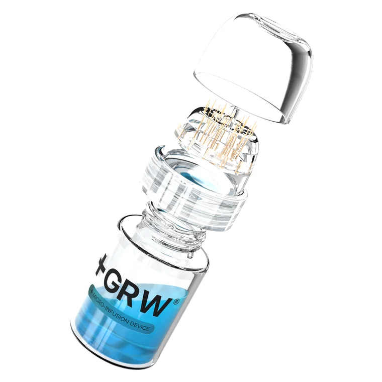
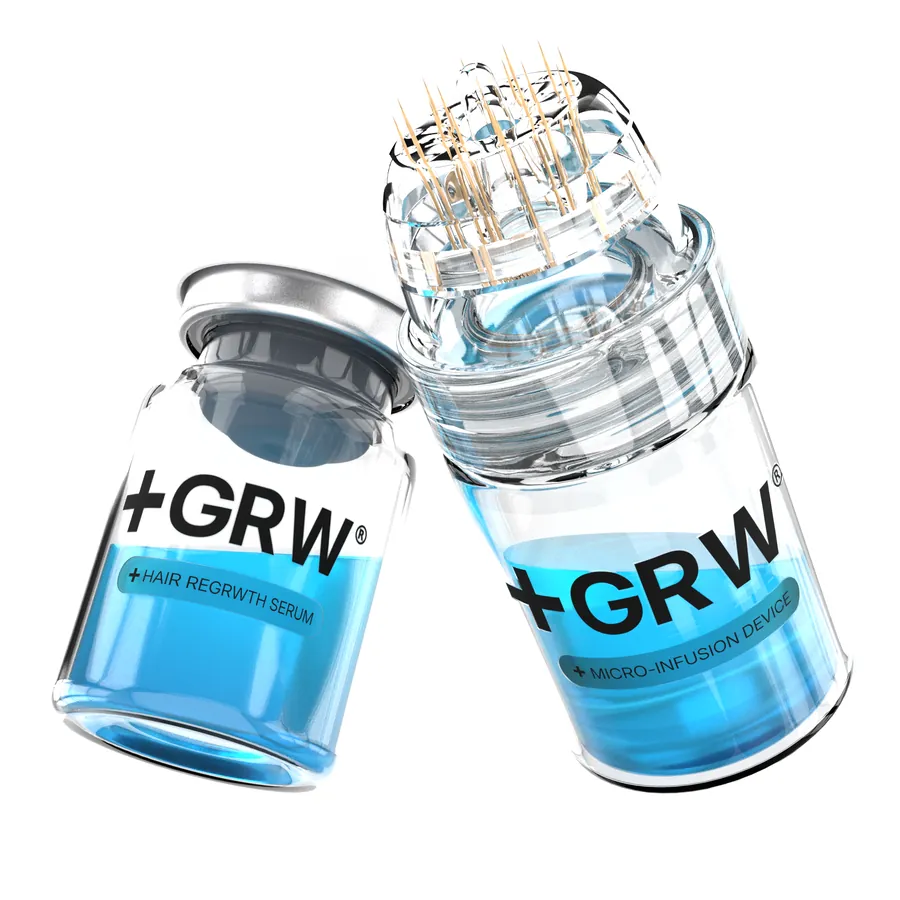
A 24K gold-tip micro-infusion device and a peptide serum, sold as one system. We built the brand, the retail packaging, the full ad library in English and Arabic and the Shopify store it all points at, then took over the ad account and rebuilt it to scale. Seven figures in sales inside five months.
Built from nothing in eight weeks, for a product most people had only ever seen inside a clinic.
Results
What the work moved
Brand identity
Medical, without the cold
The mark is a cross set into the wordmark, so the clinical claim is made by the logo before a line of copy has to make it. It is built to be assembled: the cross lands first, then GRW, then the rest of the name. Three colourways, and it has to hold on all of them.
Deep teal reads as clinical without reading as a hospital. The serum blue is used once per layout and never anywhere else, so the eye always lands on the vial.
The challenge
An account that could sell, but could not scale
GRWOOTS already had an ad account running. The campaign architecture was outdated, creative testing was inconsistent, and nothing in the structure was set up for Meta's Andromeda algorithm, which rewards creative diversity above everything else.
Health and wellness is one of the most competitive categories on Meta. Standing out there needs more than good creative: it needs localised creative that speaks to each demographic in its own language and context. That meant doing the research, rebuilding the structure, and then flooding the system with variations that were actually worth testing.
Paid media
Decode, flood, read, compound
Four phases, run in order. The first two build the machine, the second two make it get smarter on every cycle.
We took the account over and rebuilt it from scratch, Andromeda-ready, with campaign architecture designed for Meta's creative diversification. Alongside it, research and copymining: the competitive landscape, the words customers actually use, the pain points and the winning angles across the category.
Then volume. A high number of creative variations, localised across demographics, with the language adapted per segment and creators matched to the audience they were speaking to. Structured naming, systematic hook, angle and format testing, and short iteration cycles running the pipeline.
Every signal tracked, and one answer kept coming back: the VSL was the top performer. Health and wellness audiences give their attention to longer educational content that earns trust before it asks for anything, so we leaned into the format and tested variations of it against the short cuts.
Structure, localisation and the VSL format stacked on each other. Cost per acquisition fell 23% against the baseline we inherited, revenue reached seven figures in under five months, and the system kept improving with each round.
The signals we read
Inside the vial
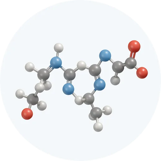
Five actives, and a way past the skin
A topical sits on the scalp. The device opens a path through it, so the question the whole product has to answer is what travels down that path. Each active gets its own tile, because a shopper comparing this against a clinic wants to read the list.




Packaging design
A box that has to pass for medical
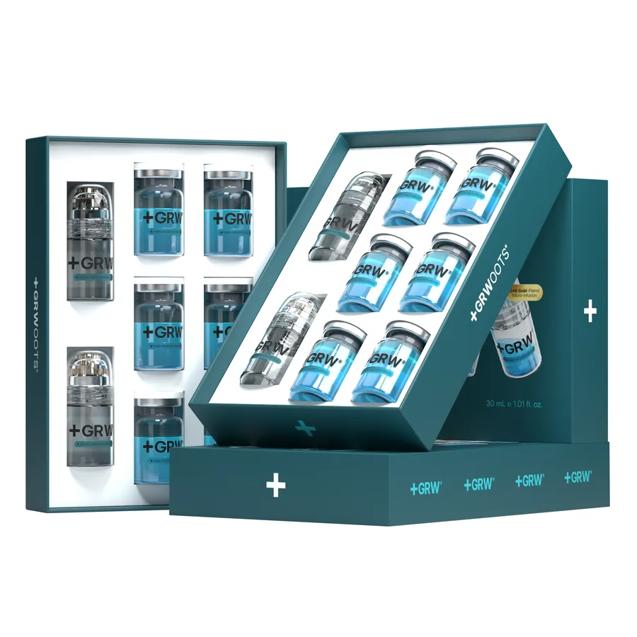
Four weekly vials in a tray, a device, and the leaflet. It sits next to pharmacy packaging in a bathroom cabinet, so it is built to survive that comparison.
How the ad library was built
One objection, one ad
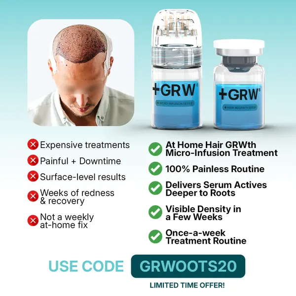
Nobody buys a scalp device on aesthetics. Every creative was commissioned against a specific reason someone had for not buying, and shipped in English and Arabic so the Gulf audience saw the argument in its own language.
| What stops the sale | The creative that answers it | Shipped in |
|---|---|---|
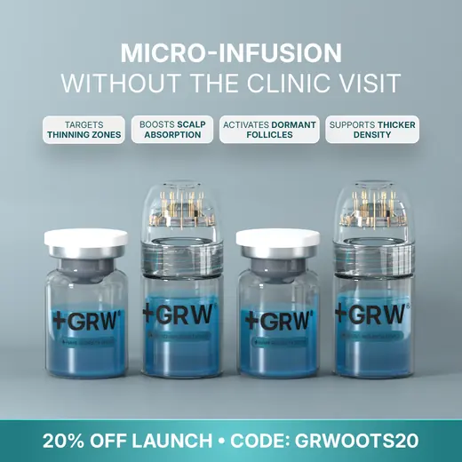
| "That only works at a clinic." | Micro-Infusion Without the Clinic Visit | EN, AR |
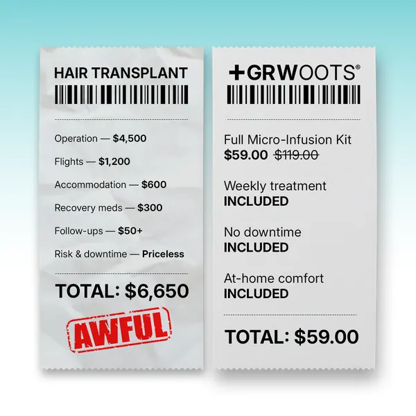
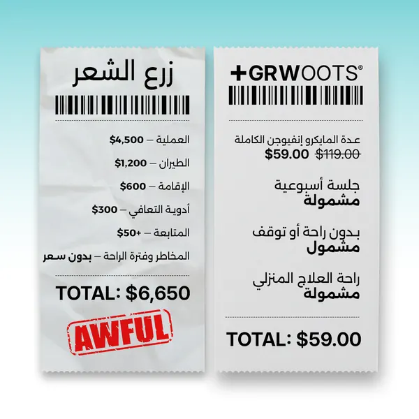
| "A transplant costs thousands." | Compare Receipt, $6,650 against $59 | EN, AR |
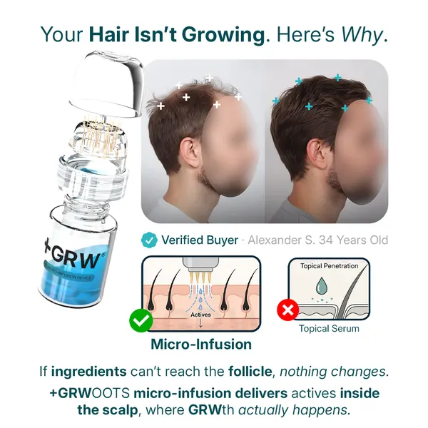
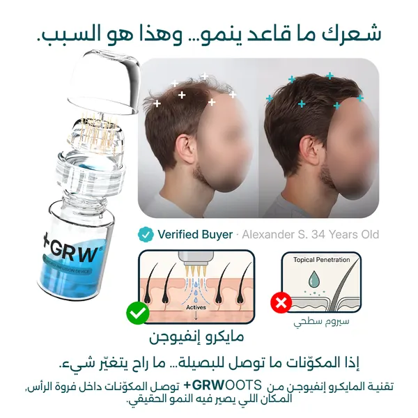
| "Serums have never worked on me." | Blocked Follicles = No Growth | EN, AR |
| "How long before I see anything?" | Visible Hair Density in 4 Weeks | EN, AR |
| "Is this only for men?" | Men and Women Regrow With This | EN, AR |
| "My crown is the problem, not the hairline." | Crown Thinning Fixer | EN, AR |
| "I am already shedding, it is too late." | Stop Losing Hair | EN, AR |
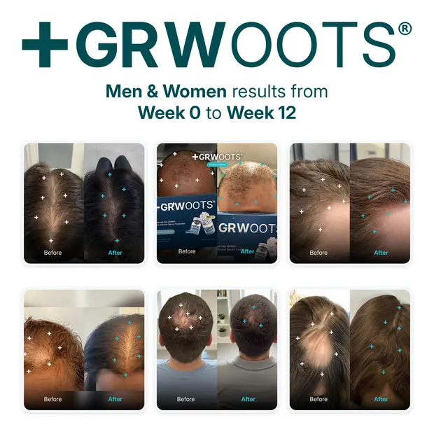
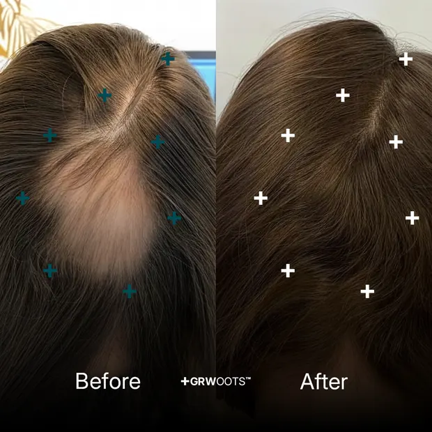
| "Prove it." | Week 0 to Week 12, six real users | EN, AR |
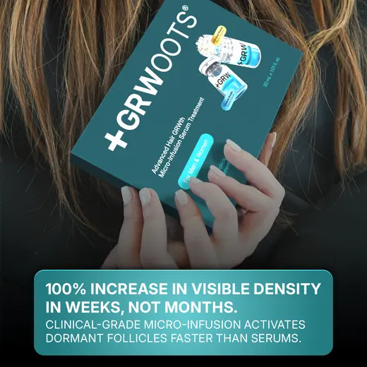
Every row is a shipped file, not a plan. Eight objections, sixteen finished statics, plus the reel cuts.
Content production
The library
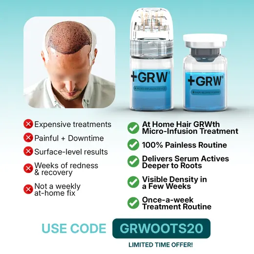
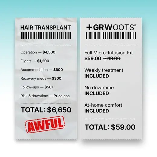
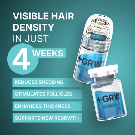
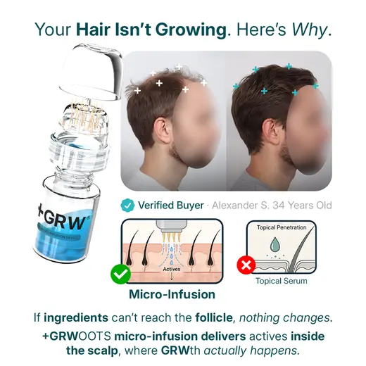


The same argument, in Arabic
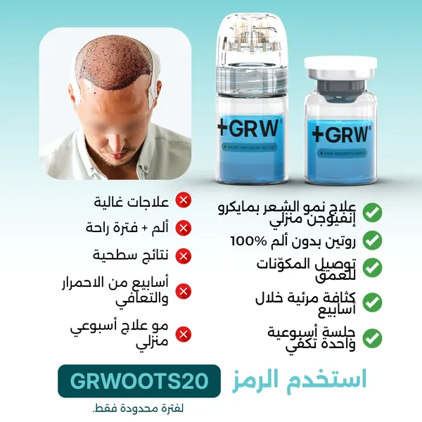
Half the audience is in the Gulf. Each creative is rebuilt right to left rather than captioned, so the comparison column, the tick list and the eye's entry point all flip.
Proof
The asset the whole funnel rests on
A category like this lives or dies on the before and after. We built the grid as a repeatable template so a new user photo drops straight in, at the same crop, the same lighting correction, the same week markers.
Shopify store
A product page that has to teach before it sells
The page is ordered the way the objection map is: what it is, why topicals fail, what a session looks like, what twelve weeks looks like, then the price. Largest contentful paint lands at 1.8 seconds on mobile.


They built the brand and then made it sell
“We had a device and a serum and no way to explain either of them to someone scrolling. Mira Visions built the whole thing, the name on the box, every image on the site, the ads in two languages, and then took the ad account apart and put it back together. The creative is what did it. We went past seven figures in five months.”