GRWOOTS logotype animation
GRWOOTS logotype animation, the cross spinning in before GRW and OOTS arrive, cycling through white, black and brand blue.
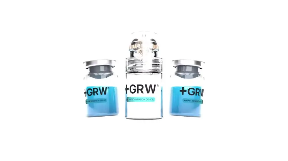
Mira Visions built GRWOOTS from scratch, the brand identity, the premium packaging, the product and lifestyle content, and a clear, carefully built Shopify store, for a clinical micro-infusion hair-growth kit.
Read the case study- Running time
- 0:10
- Format
- 1280×448
- Sound
- None, a silent film
- Mira Visions
- Made by Mira Visions
The brief
The GRWOOTS mark is a cross set into the wordmark, so the logo makes the clinical claim before any copy has to. The animation had to show how that mark is put together, piece by piece, and prove it holds on every background the brand uses, from packaging to the store header to a story frame.
What Mira Visions did
Mira Visions designed the GRWOOTS identity as part of the full build, then animated the logotype from the original artwork rather than redrawing it, so the moving mark and the printed one are the same drawing.
Tools
- Illustrator
- After Effects
Where it runs
A wide banner format, silent, made for a site header band, the opening or closing card of a video, and brand presentations. It is short enough to loop without feeling repetitive.
Delivered as a 1280×448 wide banner file, 0:10 long, silent.
Behind the scenes
The mark was built to be assembled: the cross spins in first, then GRW arrives, then OOTS. The animation simply follows the order the logo was designed in. It then cycles through the three colourways, white, black and brand blue, because a mark that only works on one ground is not finished. Watching it change colour is the quickest way to check that it holds. The same assembly order is used wherever the mark animates, so it always arrives the same way.
More films from GRWOOTS
Let's build something worth talking about.
Tell us about your project. You'll hear back within 24 hours with honest next steps, no pressure, no jargon.
We reply to every inquiry within one business day.