Quedebio · Moroccan oils, bottled in France
One mark, borrowed from a carpet
The work
Argan, prickly pear seed and a cleansing oil, pressed in Morocco and bottled in Grenoble. We built the mark, the bottle system, the printed cartons and the ritual set that goes with them.
Four weeks of design, thirty brand assets, ten applications.
Results
What the work moved
The mark
Read it three ways
The emblem is doing three jobs at once, and it only works because none of them shouts over the others. Look at it once and it is a letter. Look again and it is a motif you have seen on a rug.


It is a Q
The oval is the bowl and the wave underneath is the tail, detached and set loose so the letterform reads at favicon size without the descender closing up.

It is an Amazigh sign
An oval quartered by a cross is one of the oldest shapes in Amazigh weaving and silverwork, carried on rugs, on doors and on skin. The brand is Moroccan, so the mark borrows a form the audience already recognises rather than inventing one.
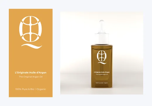
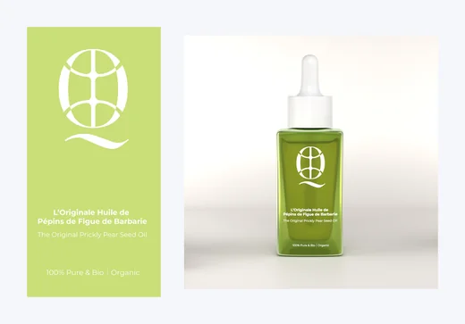
Gold and green
Green for the plant, gold for the oil pressed out of it. Gold never appears as a gradient or a foil effect, only as a flat ochre, which is what keeps it looking like pigment rather than decoration.
The range
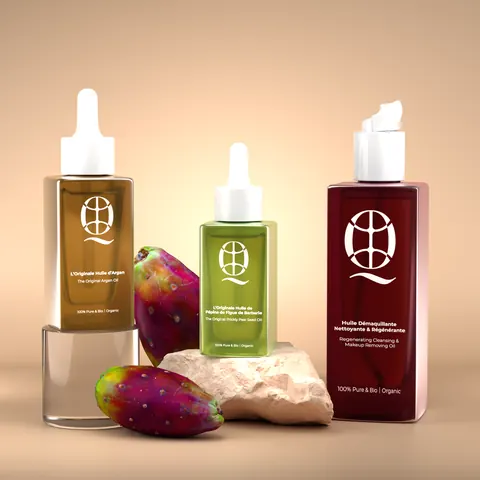
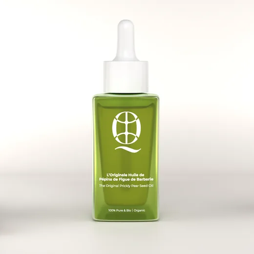
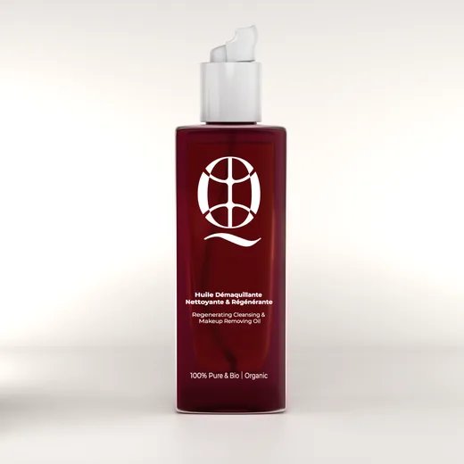
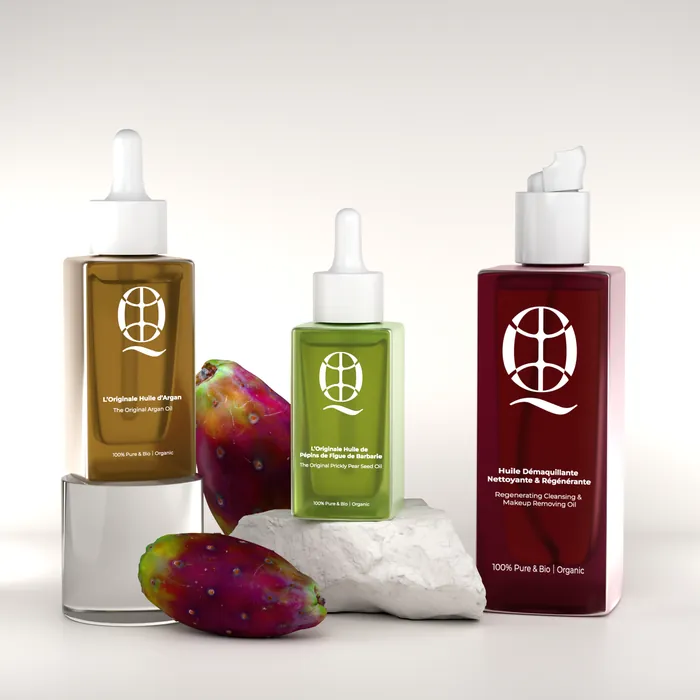
One bottle, three oils
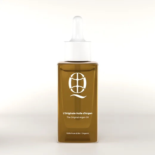
A single squared glass flacon across the line. Only the juice colour, the name and the cap change, so the tooling cost stays at one bottle and each oil still has a shelf identity of its own.
Packaging design
Flat sheet to filled bottle
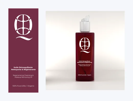
Each oil ships in a printed carton as well as the flacon, so the artwork had to be drawn as a dieline first: panel widths, glue flaps, the barcode block, the bilingual ingredient and usage panels, and the Made in France mark. Three colourways off one structural drawing.
The ritual set
The oil needs a hand to apply it
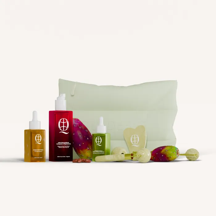
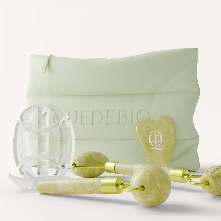
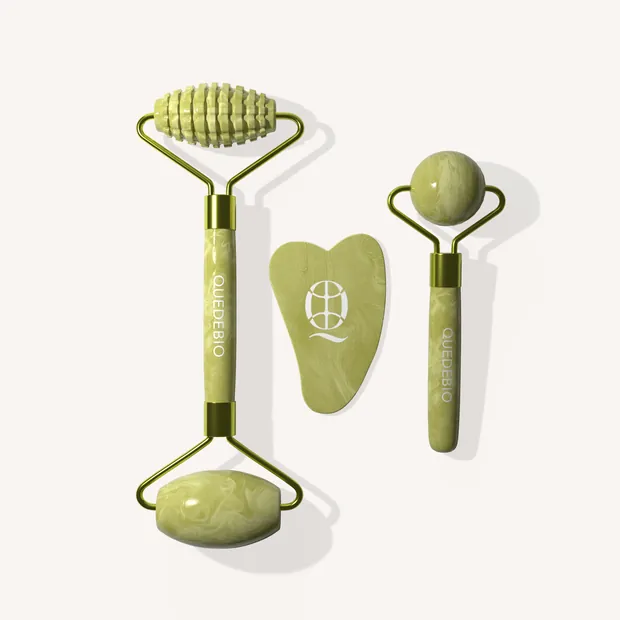
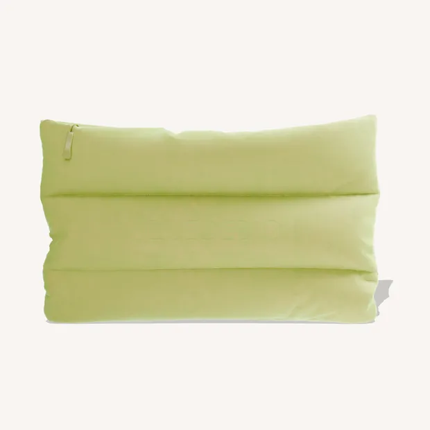
An oil is a two minute ritual, not a squeeze and go, so the range extends into the tools that ritual uses: a jade roller, a gua sha, a facial fork, and a canvas pouch with the mark embossed rather than printed.
Art direction
Two registers, one brand
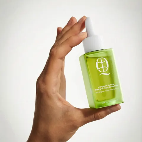
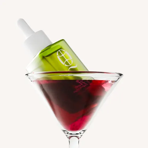
The catalogue shots have to sit next to a pharmacy listing, so they are clean, frontal and honest about the product. The campaign shots do the opposite: the oil served in a coupe glass, held to the light, treated like something you would order rather than something you would prescribe.