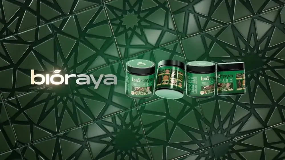
Bioraya logotype animation
Bioraya logotype motion, the leafed o rising alone before the rest of the name grows out from it.
A complete brand, packaging, content and store build for an organic Moroccan women's wellness product.
Read the case study- Running time
- 0:05
- Format
- 2040×600
- Sound
- None, a silent film
- Mira Visions
- Made by Mira Visions
The brief
The whole Bioraya identity hangs off one letter: the o carries a leaf where an accent would sit, so the mark and the name are the same object. The animation had to make that idea visible, so people see the mark on its own and then understand it is part of the word.
What Mira Visions did
Mira Visions designed the Bioraya identity, the leafed o and the logotype built out of it, as part of the branding and packaging work for the launch.
Tools
- Illustrator
Where it runs
A very wide, silent band, sized for the website header and for a title card at the start of the brand's videos. Because the leafed o can also stand alone as an app icon, the animation shows both versions in one piece.
Delivered as a 2040×600 wide banner file, 0:05 long, silent.
Behind the scenes
The leafed o rises alone first, then the rest of the name grows out of it, like a plant from a seed. The order matches how the mark is meant to be used: alone at sixteen pixels as an icon, or as the full logotype on a label. One short animation shows that both versions are one drawing. Because the leaf takes the place of an accent, the name stays simple to read on the label, the site and the jar alike.
More films from Bioraya
Let's build something worth talking about.
Tell us about your project. You'll hear back within 24 hours with honest next steps, no pressure, no jargon.
We reply to every inquiry within one business day.