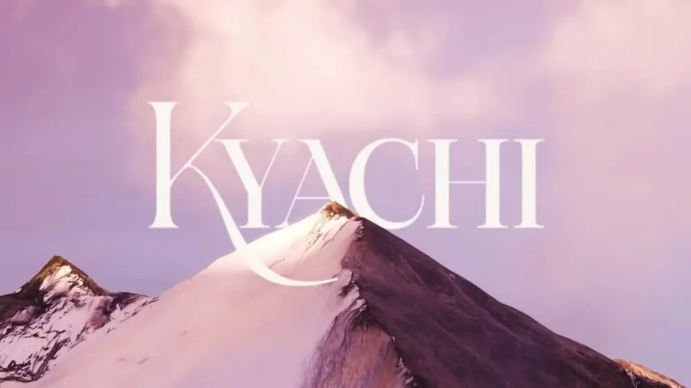
Kyachi logotype animation
Kyachi logotype in cream on a plum ground, the brand floral line pattern drifting slowly behind it.
Brand identity, packaging, content and a fast store for a women's hormonal-balance supplement, the full kit.
Read the case study- Running time
- 0:12
- Format
- 1440×424
- Sound
- None, a silent film
- Mira Visions
- Made by Mira Visions
The brief
The Kyachi logotype is written, not set: a high-contrast display serif with one long swash running out of the K and under the whole word. The animation had to let that logo hold a band on its own, quietly, so it can sit on the store and in content without competing with the product.
What Mira Visions did
Mira Visions designed the Kyachi identity, including the logotype and the floral line pattern behind it, and produced this motion piece from those same brand files.
Tools
- Illustrator
- Premiere Pro
Where it runs
A wide, silent band of about twelve seconds, made to run behind or between sections of the store and as a calm brand card in social content. It is built to loop, so it can stay on screen as long as a page needs it.
Delivered as a 1440×424 wide banner file, 0:12 long, silent.
Behind the scenes
The logo needs almost no movement, so it gets almost none. Cream type sits on plum, the brand's floral line pattern drifts slowly behind it, and the word seems to breathe rather than animate. Holding back was the decision: a swash that strong would look busy if it moved, so the motion is given to the pattern and the logotype is left to be read. One soft light passes across the letterforms, the only highlight in the loop.
More films from Kyachi
Let's build something worth talking about.
Tell us about your project. You'll hear back within 24 hours with honest next steps, no pressure, no jargon.
We reply to every inquiry within one business day.